MakeMusic finally released SmartMusic 10.2 today. Highlights of the new features:
- Support of Mac OS X Leopard
- Microphone Check Wizard ensures proper microphone levels for recording and assessment
- Easier-to-Use – many aspects of SmartMusic have been simplified and made more intuitive, including the installer, login process, activation, and update messaging
- Create assignments with audio-quality accompaniment for any concert selection. Simply upload the audio file and distribute sheet music; then your band, orchestra, and choir students can practice their part with accompaniment in SmartMusic.
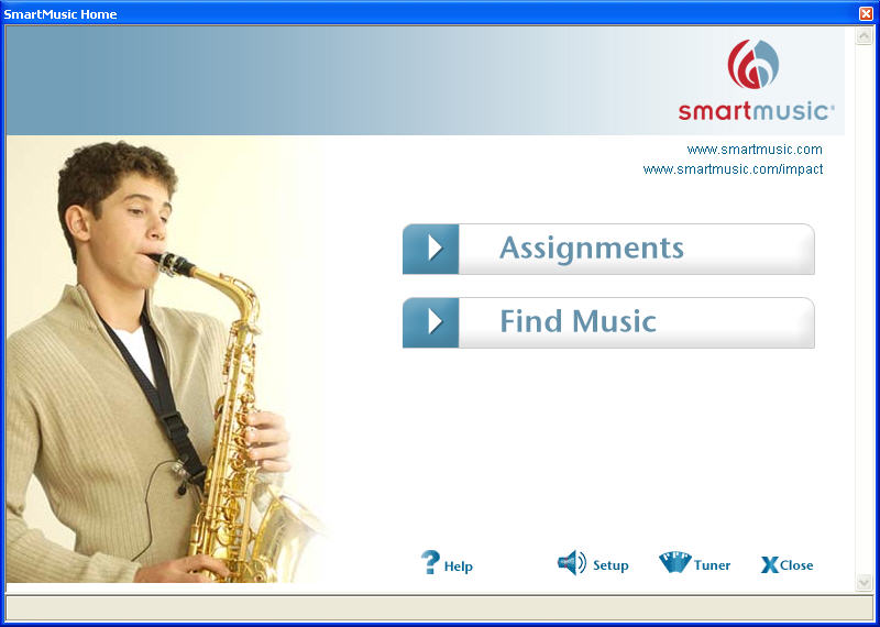
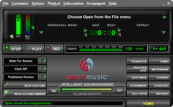
There are some other “features”, but these are the ones that are interesting. Especially the last one. The update is about 80 megs for Windows, 97 Megs for Mac. So, how does it work? In a word, the same as before…. Basically, they updated it to support OS X 10.5. That was it. They have this new “HOME SCREEN”……..  which, basically, replaced the older one which wasn’t much different. It didn’t have the cute little pictures of kids playing. *Yawn*. You get dumped to this new home screen all the time, and it doesn’t remember where you last were on it. So, if you had clicked find music before leaving the home menu, SmartMusic 10.2 doesn’t remember that. What I’d like to have seen is perhaps it using the screen more, and having a long list of what you recently played, instead of it being buried under 3 clicks, and having it be a little pop-up window. That would have made the home screen more useful. Or maybe have the home screen take up the whole screen, and have the options display to the right after you click things. There are a lot of things that could make it more appealing. Closing the home screen, you get the same interface that looks like it came out of the 80s.
 I still think this thing needs to be redone. It has to be the most retro thing in smartmusic. Why not make it bigger, and have an active tuner going? So, people can see how their pitch is while they are playing. Or make it more game like and have a running tally of your “score” while performing a piece? Granted, this screen doesn’t come up much anymore, but a version of it exists when you have music on the screen.
![]() Again, it would make a lot of sense to make the strip at the top a lot more functional. Have a pitch meter. Have some sort of “score” happening. Kids would like that, they like games or trying to beat stuff. Make the bar and beat and the repeat thing bigger. Use the real estate.
Again, it would make a lot of sense to make the strip at the top a lot more functional. Have a pitch meter. Have some sort of “score” happening. Kids would like that, they like games or trying to beat stuff. Make the bar and beat and the repeat thing bigger. Use the real estate.
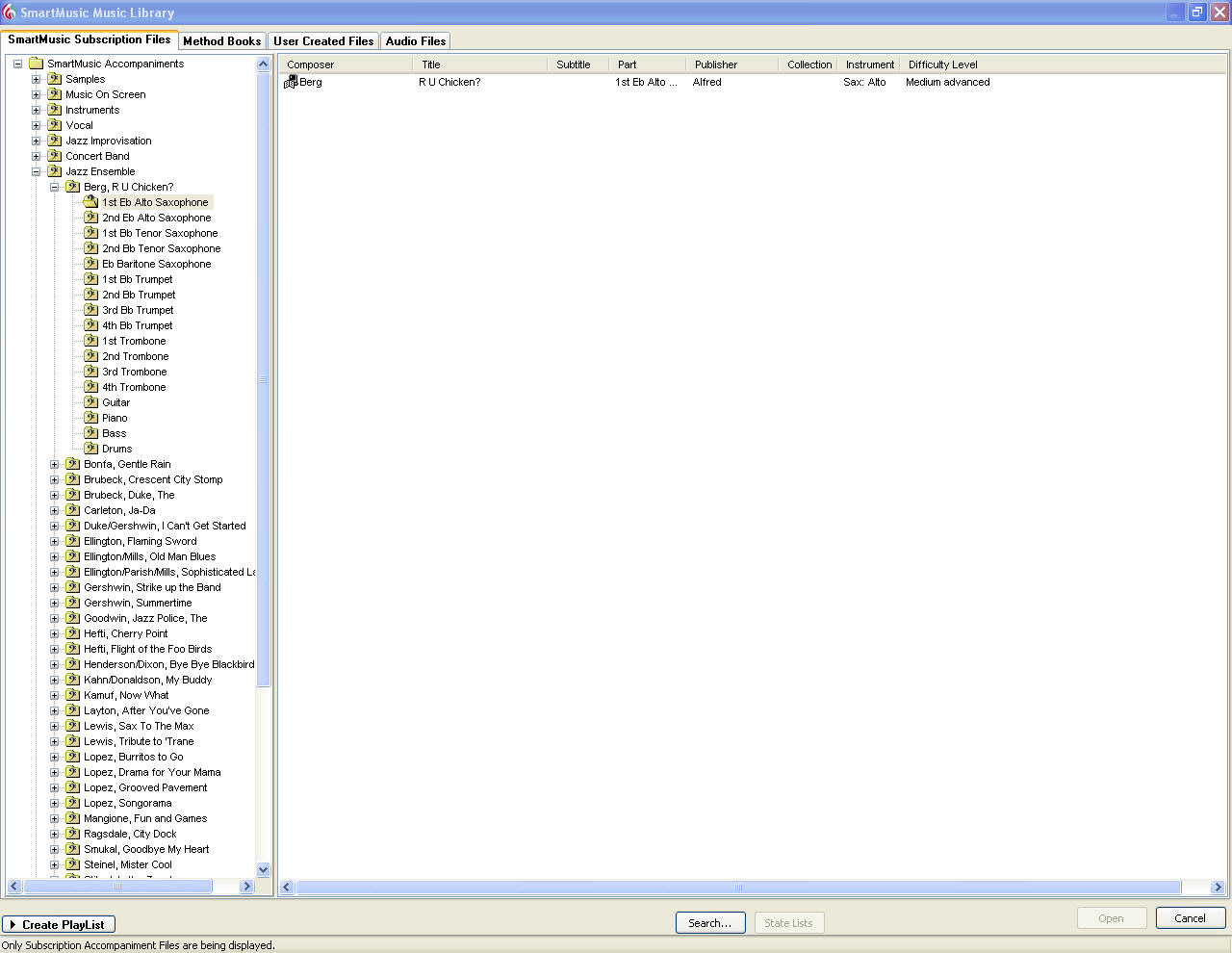
Oh, and the Library Browser thing is exactly the same, and still is the weakest part of the program.  You still cannot make multiple playlists, which cripples the smartmusic for a teacher. Being able to have student playlists, or playlists for instruments would make SmartMusic infinitely more valuable. The whole browser is not intuitive. Why can’t we select “Alto Sax” and just have all the Alto Sax parts displayed? Currently, you get to see every single part. Or how come users can’t add their own ratings to songs? Or write notes about it? These seem like really, really simple additions that should have been added to a .2 version of a program.
The “Create assignments with audio-quality accompaniment for any concert selection. Simply upload the audio file and distribute sheet music; then your band, orchestra, and choir students can practice their part with accompaniment in SmartMusic.” feature I cannot find. Perhaps I’m missing it, but I don’t see anything to do this. Maybe this is part of the Impact thing? Or something that an update to Finale 2008 will do? I don’t know.
Verdict? It is a free update, but SmartMusic 10.2 offers nothing new except for Mac OS X 10.5 (Leopard) compatibility. The new Home Screen doesn’t fix any of the problems SmartMusic has. It is a mere band-aid. Revamp the Library browser, and really make improvements to make the program intuitive rather than saying they have is needed. With the frequency that MakeMusic comes out with updates to SmartMusic, I’m wondering if they will ever will fix problems or, as they do with Finale, ignore them and pretend they do not exist. This program is still good to have, especially if you can get it for the $25 a year price. The shear number of Concert Band songs will keep anyone occupied for a long while. MakeMusic does update date the library, but it is hard to figure out what is new when they do (unless you go to the website, which usually is delayed in reflecting the additions).
7 out of 10. Points deducted for generally frustrating interface and a host of bugs (like my on going microphone issue). I’ll be doing a review of running this on Mac OS X 10.5.2 when I update my Mac to run it.
Try StarPlay! The interface contains everything you’re after – an ongoing game score, an active tuner and even a choice of display – video and score or score only. Click here to see a screenshot.
It’s also free to download. If you’re interested in reviewing StarPlay, please contact me at michelle@starplaymusic.com.
Sadly, this program has not even 1/10th of what SmartMusic has. Strike that, not even 1/100th of what SmartMusic has. I like to complain about SmartMusic, but they do have a HUGE library of songs with real band accompaniments. However, their interface sucks. And the green line follow along thing blows. It is a HUGE distraction. I don’t think it really helps kids out, and for me, it makes me mess up cause I tend to look at the line and stop counting. And the line is ever so slightly behind for me, and you can’t tweak it with the real accompaniment files.
True, people who use Sibelius will be happy they have a sorta clone of SmartMusic for Sibelius files. Hopefully it doesn’t limit the output to lame midi sounds like SmartMusic does. HOPEFULLY you can use Garritan sounds. Or something similar.
I’m always open to new programs, however, this one doesn’t look like it is really there yet. Lacks the library, and even the method books from what I see.
10.2 was mainly developed to work through some issues students and teachers were having with getting through the assignment process. I think some of the most significant updates are ones you wouldn’t really come across in your use of the software (such as the mic wizard inside the assignment loop). Then there were some modifications to the subscription stuff, bug fixes, etc. And of course Impact itself has gone through many updates.
I very much agree with many of your thoughts on ways to make the program better. There needs to be some serious redesigning to make this program attractive to its target audience.
Sadly, there still is NO SUPPORT for using other microphones on the Mac. I don’t believe how stupid that is. Heck, FREEWARE programs like Audicity can find and use my MOTU 828, and finds my M-Audio USB interface. SmartMusic…….not smart enough to find it. Lame….should be so easy to add to the program as well……
One of the new things SmartMusic was, I thought was the ability to make SmartMusic things with real audio. “Create assignments with audio-quality accompaniment for any concert selection. Simply upload the audio file and distribute sheet music; then your band, orchestra, and choir students can practice their part with accompaniment in SmartMusic.” I totally don’t see how to do this.
And the Impact stuff……..that has to be the most confusing thing ever. Whomever designed it needs to be sacked. And sacked again. The most confusing thing ever.
Yes. MakeMusic needs to step it up. They have a huge advantage right now in their library compared to that StarPlay program. But that has the backing of Avid, so, given enough time, it will catch up if things keep going as they are. I really think this should have been 10.1.5 or something. Not 10.2. There was really nothing added other than the annoying Home page……
Perhaps you tried Impact before all of the usability improvements? Feedback has been pretty positive on Impact. From the monthly subscription reports, it seems we can estimate that at least 15000 to 20000 students have been using it with their teachers, and that’s a surprisingly large chunk of the userbase considering this was the first school year for it. What do you find confusing about it? There have been many changes since the initial design, and it’s now pretty simple to get through the setup and get started scheduling assignments.
The audio file bit is something I think you already knew about in 10.0 (it’s listed in the 10.2 info as an existing 10.0/10.1 feature). It’s just saying that you can use your own audio recordings in SmartMusic, and you can make assignments for your students from those recordings. You import the audio file into SM, open the audio file, and click the Assignment button to start the process.
“There was really nothing added other than the annoying Home page……”
The Home screen was probably the least significant change for 10.2. The real changes really were about improving the assignment loop process. But if that’s not the area of SM you’re using, you probably aren’t going to find it a very interesting update. Teachers who are using Impact seem to feel it’s a lot more significant.
Oh, is that what it is? The way I read it, I thought it would be something akin to making one of the cool real audio arrangements.
Perhaps I need to play with it more……it just seems to be rather rigid in how it does things.
SmartMusic is pretty clunky. A lot of work has been happening on the backend to modernize the program in the last year or so (such as switching from utf8 to unicode for string handling), so I hope they will soon get to the clunky interface. I keep using them because of the large library; nothing else is more convenient than SmartMusic when a beginner student forgets his or her method book. The solo selection is not great, but, for a private teacher, the method book selection is nice.
The 10.2 added the home screen, but it’s biggest feature was Leopard compatibility. (The 10.1 version crashed on open.) On Mac, the home screen hides a nice fix: SM no longer asks to go through the setup wizard every time it starts.
Agreed. The library is huge, and they have been fairly regular in updating it. That alone is worth the price of the program and suffering it’s dated and backwards interface.
I totally forgot about that setup thing. That was totally annoying. I don’t miss it at all, but I am getting a little sick of getting dumped back to that Home page thing all the time…..
I never did try 10.1 on Leopard. I was really waiting for it to be supported before changing over. Now, pretty much everything works well in Leopard, including ProTools M-Powered (though not officially)…